Part of our guide to guest Wi-Fi marketing
Making a guest Wi-Fi sign-in page easier to use

A guest Wi-Fi sign-in page is often used on a small screen in a busy room. Customers may be holding a bag or using assistive technology.
Making the page easier to use starts with clear information and a short, understandable task. Visual branding should support that task.
A quick check can reveal obvious problems, although it does not amount to a full accessibility assessment.
Keep labels and instructions clear
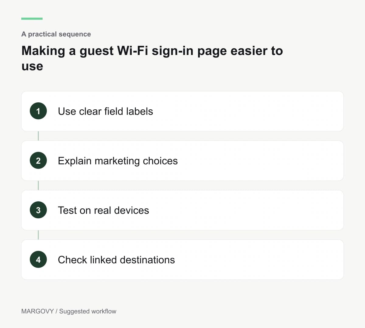
Each field needs an understandable label. Customers should know what information is requested and whether it is optional.
Do not rely only on example text inside a field. Once someone starts typing, they still need to understand what the field means.
The W3C guidance on form labels explains how labels should identify controls and be associated with them for assistive technology.
For a venue owner using a supplied form, report unclear labels or unusable controls to the provider. A background-photo change cannot correct the underlying form behaviour.
Make the marketing choice understandable
Explain marketing choices separately from the connection task. A guest should not have to interpret a dense paragraph to understand whether they are subscribing.
Keep the options readable and easy to activate. Avoid wording that makes declining feel like an error.
Margovy's guest-page features describe the sign-in fields and marketing-choice approach. Guests can use the Wi-Fi without choosing promotional messages.
Review the wording in the same way you review the visible design.
Test the experience in the venue
Use actual phones and ordinary venue lighting. Check whether text remains readable against the chosen image and whether controls are easy to identify.
Try enlarging text using the device's settings. Look for cropped instructions or buttons that disappear.
Follow the journey after an invalid entry. The page should help the guest understand what needs correcting rather than leaving them at a generic error.
Where possible, include users with relevant access needs in the review and arrange specialist testing for a fuller assessment.
Check the destination too
A usable sign-in form can lead to a menu or booking page that is difficult to read. Follow the important links on a phone.
Prioritise current, readable information over a crowded list of promotions. Provide a way to ask staff for help.
See how Margovy's guest journey works, and contact the team with specific examples of barriers you find.
Record the device, step and observed problem so the person investigating can reproduce it. Retest that journey after a fix.